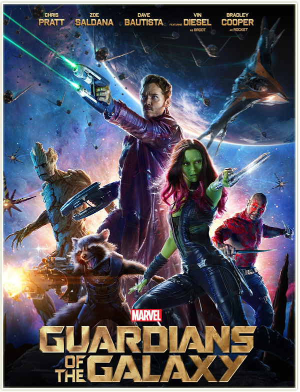
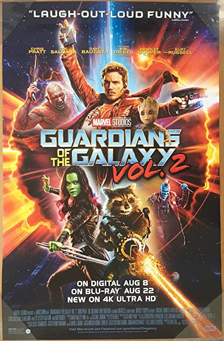
This week we were tasked with analyzing an existing visual design within our subject area and for this, I chose the Guardians Of The Galaxy movie posters since my subject area is Sci-Fi.
I chose to look at both films movie poster to see the differences between them as you can see they are both action-oriented to show the genre of the movie as well as attracted peoples attention the first movie poster is very interesting because the main character is the largest thing on the poster itself making it the center of attention.
The second movie poster is actually more eye-catching because it’s using Bluorange which is used quite often in movie posters because it works very well as they sit on opposite sides of the color wheel and are complementary colors which give off a hot and cold kind of synergy.
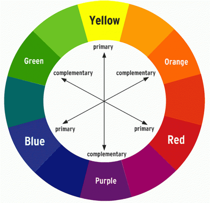
The typography in both posters other than the words “Vol2” is very sharp and bold because of the roughness of space and the sharpness of the metals that makes up spaceships as for the colors in the first poster they used a gold color as to not clash with the background and for the second poster they used Bluoranges for that as well other than for Vol2 which is red as its far enough away from blue and orange on the color wheel so that it would be readable.
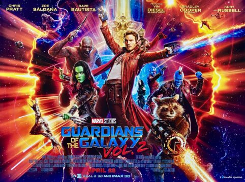
I think both posters are trying to give you insight into what the movie will be like and what to expect and it looks like they size the characters on the posters to the importance they play in the movie.
All in all these posters are aimed more towards the teens but I would say there target audience is more of the comic book type people since it was a comic book before being a movie so around 15-30 years of age.
REFERANCES
https://www.marvel.com/movies/guardians-of-the-galaxy
