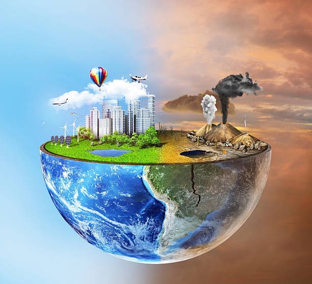
The last of Tufte’s principles is Micro/Macro readings which is the most fundamental but also the easiest to understand and to quickly paraphrase Tufte micro/macro design blurs together into one big Idea but on closer inspection resolve into smaller ideas that on their own can stand together (Tufte, 1990, P.43) take this image of the earth for example (What about the Environment? 2021). On first inspection, it seems to be a simple poster of the earth and what you could find on it currently but that’s because all the information is blurring together taking a closer look you can actually see that it is split into a utopia on the left and a dystopia on the right.
The left half of the image is dedicated to a more economically green future with its solar panels and wind turbines while the right half of the image shows what might happen to the earth if we mistreat it it even has cracks in the earth to help depict this.
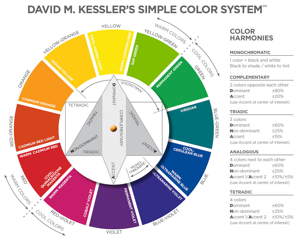
The color from both sides in particular from what we currently know of the most basic color palettes (Good vs Bad – Color Palettes, 2021). This is what makes it all seem as if one side is a utopia and the other a dystopia because the left uses natural cool colors that speak of harmony and balance while the right is natural warm colors that speak of decay and pollution which is what makes us see that this so-called image of the earth (What about the Environment? 2021). Demonstrates the effect we as a civilization can have on the planet in either direction while still being an image of the planet.
Carlos Ygoa Designs. 2021. Good vs Bad – Color Palettes. [online] Available at: <https://carlosygoadesigns.com/blog/good-vs-bad-color-palettes/> [Accessed 5 November 2021].
Tufte, E., 1990. Envisioning information. Cheshire, Connecticut:Graphics.
Voices of Youth. 2021. What about the Environment?. [online] Available at: <https://www.voicesofyouth.org/blog/what-about-environment> [Accessed 3 November 2021].
- by mcfayden2020
- on November 7, 2021


