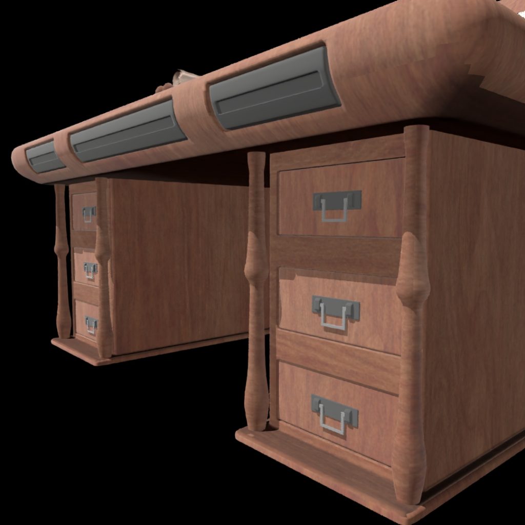
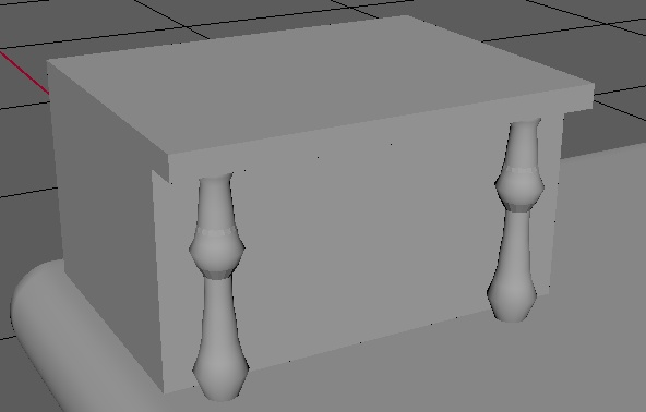
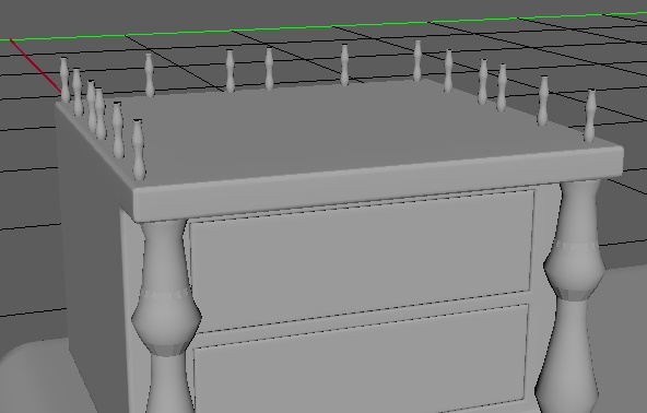
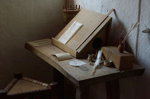
Merlins desk was the third asset I made and it was heavily influenced by a stock photo I found (Limited, 2020) since I liked the look of the overall shape and proportions of the desk in the photo so using that as a reference I set about making the desk.
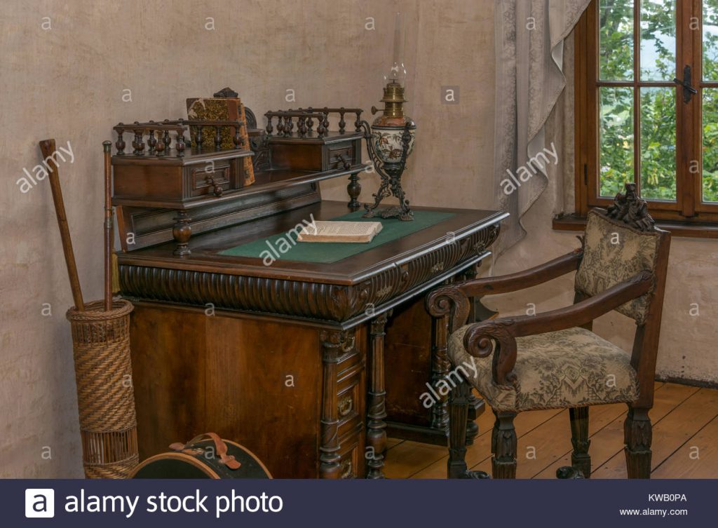
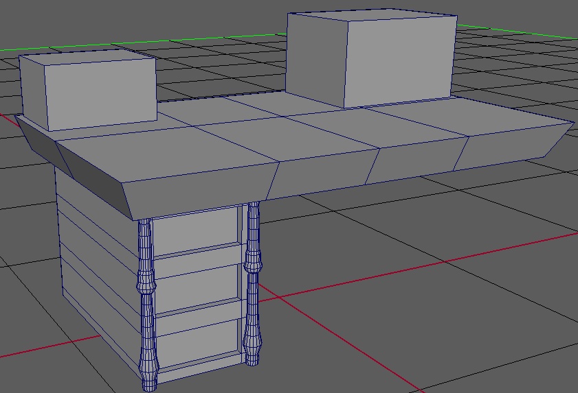
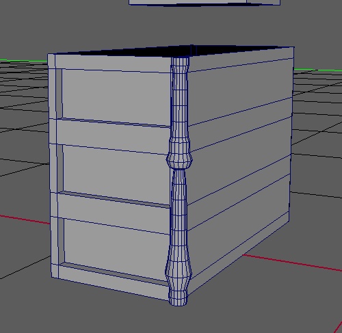
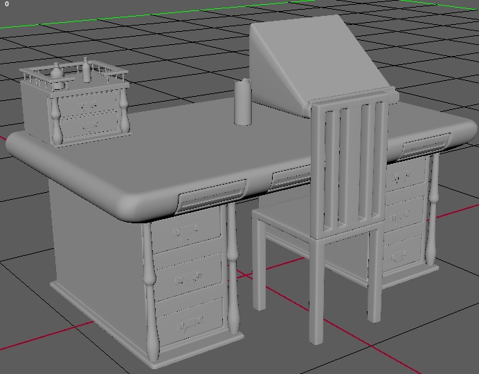
The first thing I did was measure my own desk and using that as a basis for the size of the desk in the photo I first created the basic shape of the draws since I was working from the ground up this time.
I then started working on the pillar design beside the draws using a basic cylinder the scale tool and soft selection I achieved a decent-looking design.
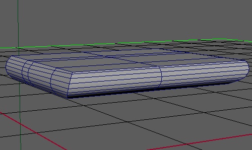
Creating the table top with 3 sides being rounded and the back being smooth was slightly hard since i had to move all the verts manually to be flat.
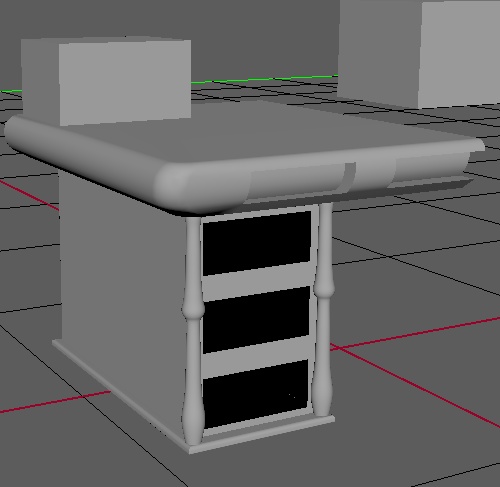
I knew I wanted to add draws into the table top from the start but getting them to do what I wanted was really difficult I tried a bunch of method to get them to look the way I wanted but couldn’t do it so the ones I eventually made where just separated from the desk and to make you think there where draws there.
I also took inspiration from another image I found that had a book stand (coeurdelhistoire | Medieval furniture, Medieval, Medieval crafts, 2020) and I used that to create my own book stand to sit on my desk however I struggled to keep it in quads when I tried orignally making the book stopping part so I changed it.
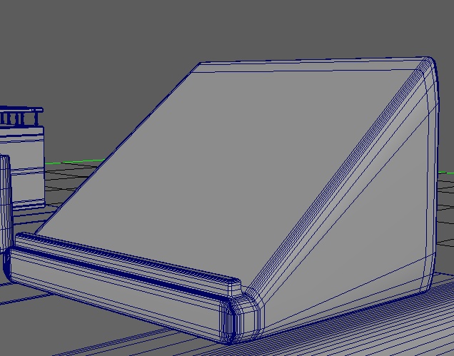
I also made a smaller set of draws for onto of the table and decided I would put potion bottles on top of it and for this I copied the original pillars that I made for the table draws then shrunk them and removed some edge loops to get a slightly different design as for on top of the smaller draws I did that all again for a second time.
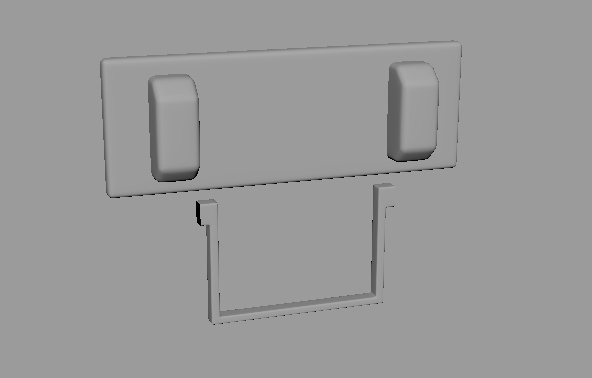
All the draw handles where the same and they where made quite simple and did not have much design to them since I had no idea how or what to do for them.
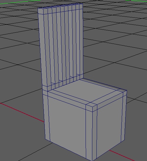
I set about making a basic chair for my desk and the one I made to start with was way too large and square which was not going to work so I thinned it to be more chair like but I kept it all as one mesh which looked strange and added in extra polys that I didn’t need.
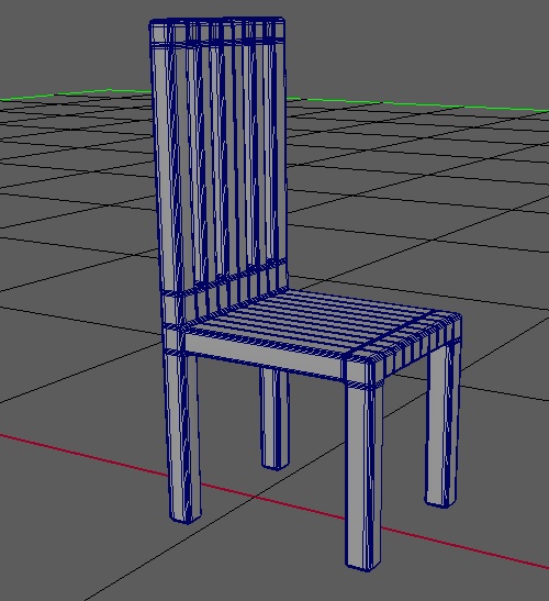
So I started again and this time made sure to keep the parts separated but the same shape and size this is the template I used to make the basic chair since I didn’t want anything fancy.
When it came to texturing I used the same 3 textures that I used for the lectern and the only metal object where the draw handles.
