Hull, United Kingdom

Category: Principles of Visual Design

Final Poster

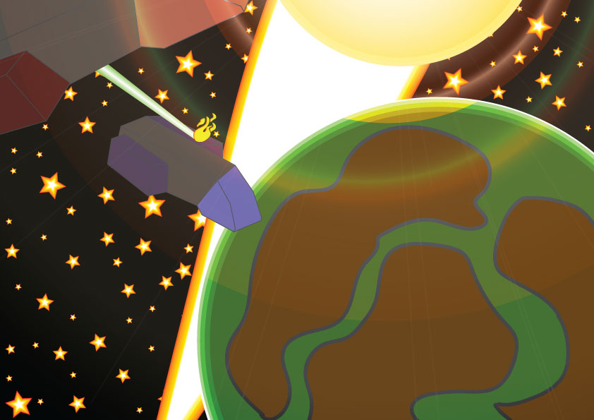
WordPress wont let me upload images over 2500 Pixels for some reason I also tried elementor to try and link the file into WordPress but no luck so I posted the final poster to Pintrest at the full A1 Size. https://www.pinterest.co.uk/pin/623818985883263818/ Just in case there is a box link as well to the full A1…
Read more
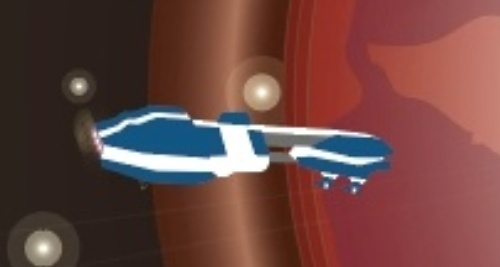
Draft Poster Design

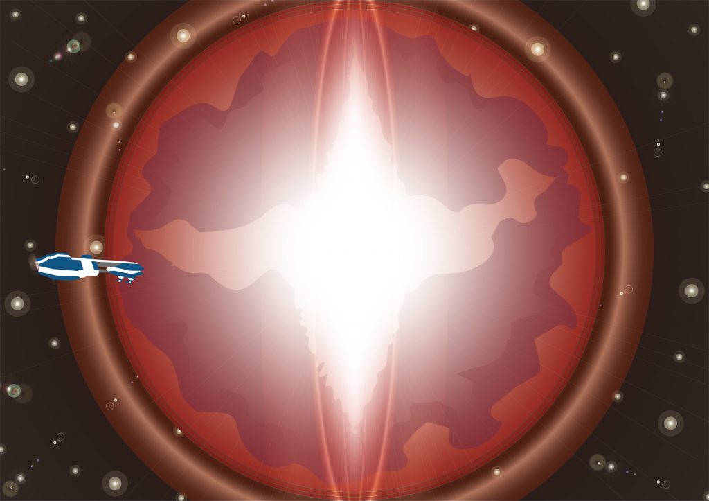
The concept for the final poster was for a planet to convey hope and there was an idea that was created to accompany this which was for a massive beam of light to emanate from the core of the planet threw the landmass out into space to symbolize hope. The flare tool was used a…
Read more

Solving your Conceptual Design Problem with Photography

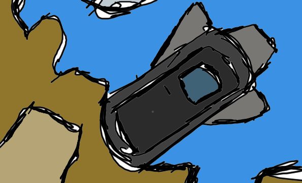
This task was very difficult to try and find ideas for ley alone actual create a piece in photoshop for but the ideas that were thought up were to capture a photo of the moon and turn it into cheese, take a picture of a spaceship and place it into a bottle or to follow…
Read more

Drawing in Adobe Illustrator

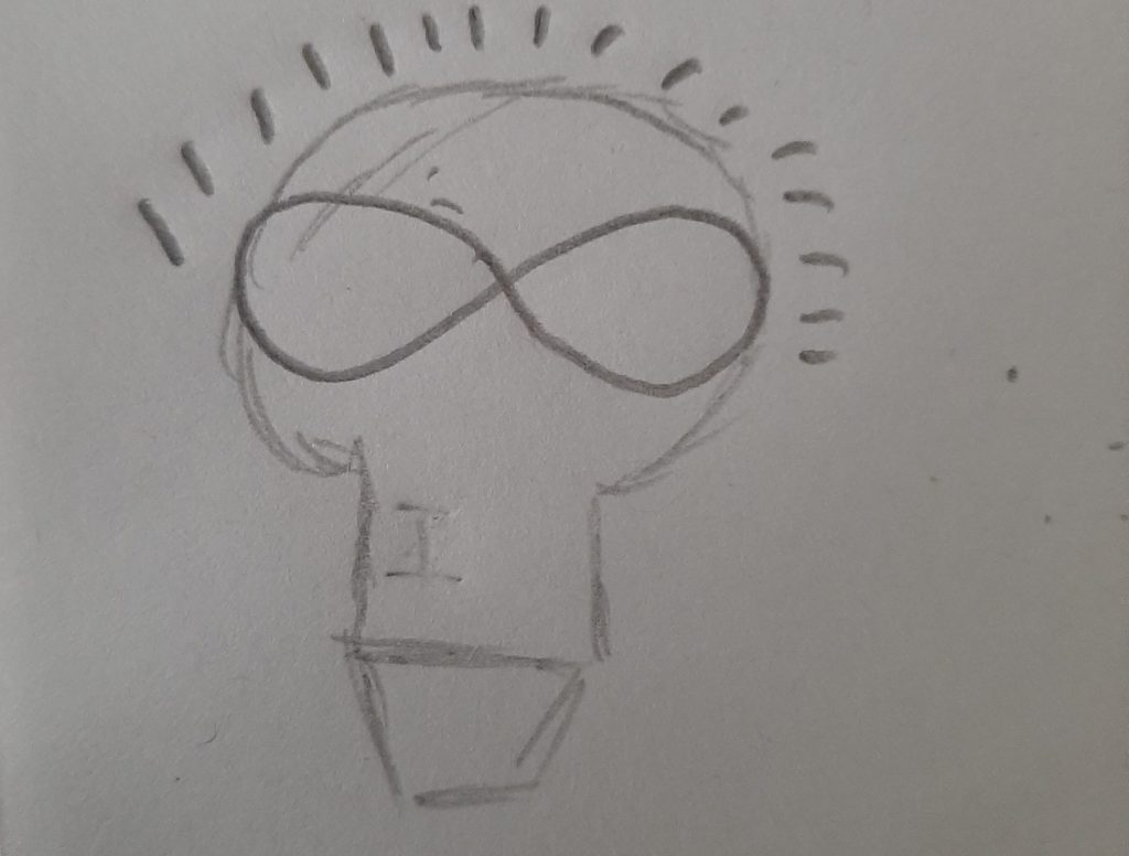
Using the tools of adobe illustrator this mock-up poster was created to try to come up with an idea of what the final poster would look like and in its creation an idea was born one that was actually conceptual and not literal. This draft type poster also took a lot of inspiration just like…
Read more

Conceptual Design Ideas

To begin with a small word cloud of ideas was created with the 6 words chosen that relate to the poster and subject area I also created some graphics for a portion of those words that could be turned into visual imagery. Using my word cloud I chose some of the words I wanted to…
Read more

Poster Subject, Purpose & Audience

For the assignments poster it’s going to be a certain promotional piece for an animation that might be created in the future and the project will be about Science Fiction which means the audience is going to be roughly 18-34 years of age since that seems to be the most common age of science fiction…
Read more

Purpose and Audience

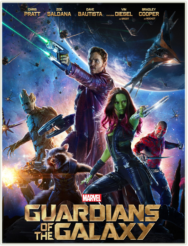
This week we were tasked with analyzing an existing visual design within our subject area and for this, I chose the Guardians Of The Galaxy movie posters since my subject area is Sci-Fi. I chose to look at both films movie poster to see the differences between them as you can see they are both…
Read more

Designing with Shapes

For this week’s campaign piece, we were asked to create a background with basic shapes and expand our use of color and for this I knew I wanted to make space since its very basic and completely in the ball park I am aiming for I decided to try and make space.  For a few…
Read more

Colour

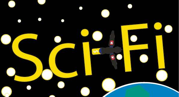
Last week I never created my graphic in Illustrator so for this week when I had to remove my name and change it to a subject that I chose to associate with my name I found it easier to do.  The obvious subject that I chose was Sci-Fi since it’s the cornerstone of everything on my…
Read more

LogoType

This week we were tasked with constructing a typographical logo using own name with last weeks creative influences as a basis and I started by writing down a few of those influences and then listing everything I can think of that is associated with those influences I also wrote my name several times in different…
Read more